Noto Sans Mono with Fira Code ligatures
Following my ligaturized DM Mono project, I’ve applied the same idea to Noto Sans Mono. You can download it from GitHub: nanxstats/noto-sans-mono-ligaturized.
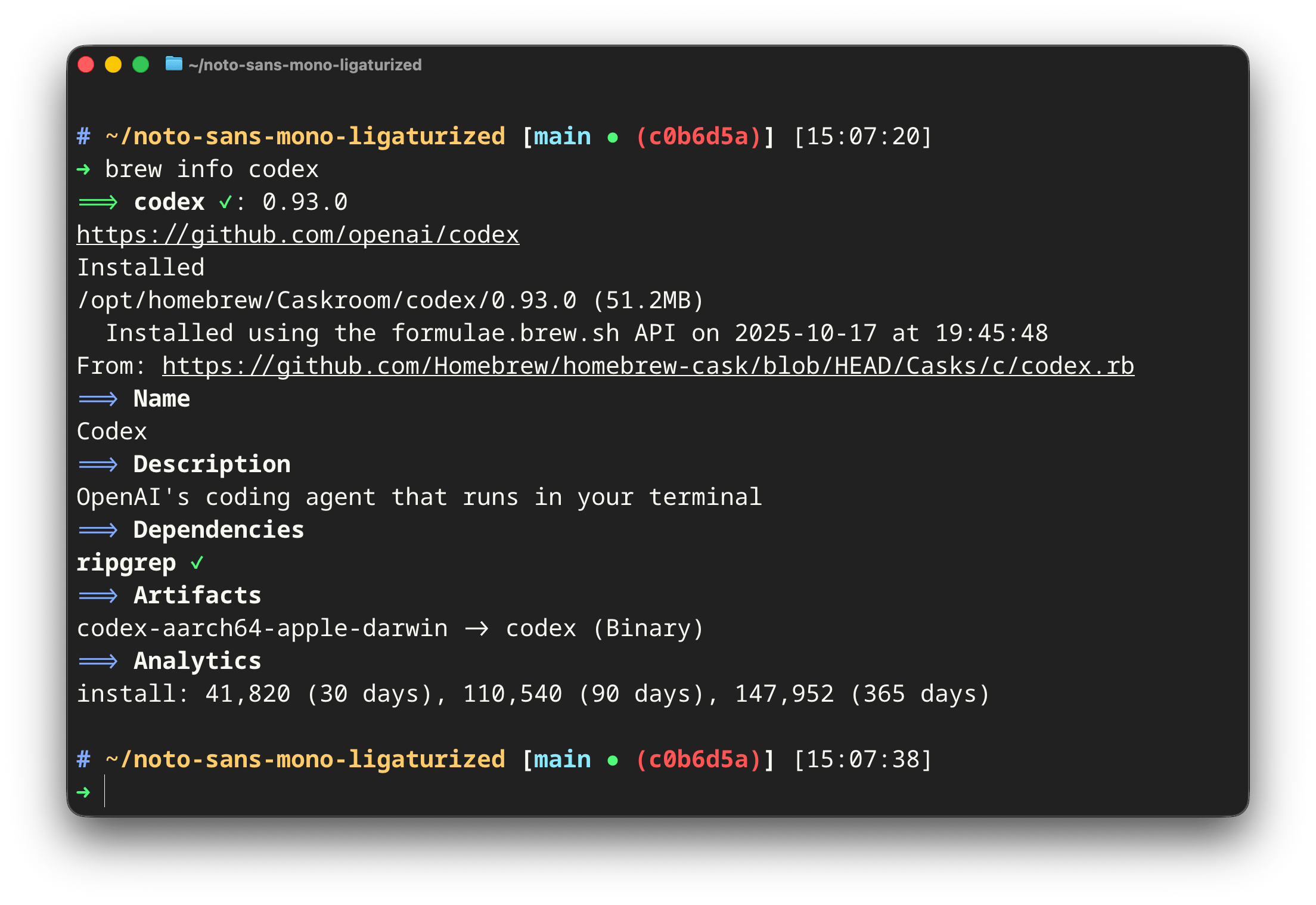
brew info in Ghostty. Theme: Dracula+.Why Noto Sans Mono?
Noto Sans Mono is designed by Steve Matteson and is the monospaced member of the Noto type family. Its design is closely related to Open Sans, one of the most popular humanist sans-serif typefaces on the web.
This heritage gives Noto Sans Mono a clean, neutral, and familiar feel.
While DM Mono might have distinctive design characteristics in glyphs like
0 @ [ ] f j k, Noto Sans Mono takes the opposite approach: it stays
out of your way. There is not a single glyph that demands attention
(which is, apparently, all you need).
a b c d e f g h i j k l m n
o p q r s t u v w x y z
A B C D E F G H I J K L M N
O P Q R S T U V W X Y Z
0 1 2 3 4 5 6 7 8 9
[ ] { } ( ) < > + - * / ^ =
! ? @ % & # $ ~ ` ; : , .
Adding ligatures
The build uses ToxicFrog/Ligaturizer with the same, one Makefile approach as the DM Mono ligaturized project. Since Noto Sans Mono has no italic variants, the output is four font files: light, regular, medium, and bold weights.
Here are some sample ligatures after patching:
<- -> => ==> |> :: :::
== != >= <= === || //
And without ligatures for comparison:
<- -> => ==> |> :: :::
== != >= <= === || //
The same opinionated ligature exclusions
apply here: sequences like &&, ??, and ;; render as separate characters
to avoid visual noise.
Setup
For VS Code:
"editor.fontFamily": "'Liga Noto Sans Mono', monospace",
"editor.fontLigatures": "'calt', 'liga'",
For Ghostty:
font-family = Liga Noto Sans MonoIf once a while you need a ligaturized coding font that naturally blends in rather than stands out, give this a try.