ggsci 5.0.0 and py-ggsci 2.0.0: Generative Color Scales from Gephi

After the last major version update in September 2025, I am happy to announce the release of ggsci 5.0.0 and ggsci for Python 2.0.0.
You can install the R package ggsci from CRAN:
install.packages("ggsci")And install the Python package from PyPI:
pip install ggsciWhat’s new
Every color palette in ggsci until now has been a fixed list: someone chose those exact colors, arranged them in a particular order, and you used them as-is. That works beautifully when you have five or eight categories. But real data does not always cooperate. You might have 15 clusters, 20 cell types, or a network with dozens of communities, and at that point, a curated palette simply runs out.
Generating purely random colors is no solution either. Random colors look random. They clash and merge, and your plot becomes harder to read.
So the real question is: how do you encode taste into a generator? That is what this release is about. ggsci 5.0.0 and py-ggsci 2.0.0 introduce generative color palettes ported from Gephi, the open source network visualization platform. The Gephi palettes give you recipes instead of fixed lists. You choose a preset that defines the mood, request as many colors as you need, and the palette grows with your data.
The original idea came from a conversation with my friend Simo about having a “YOLO” color scale (nanxstats/ggsci#71), something like the “I’m feeling lucky” button where you trust the system to make a good decision on your behalf. That idea stuck with me. Gephi’s palette generator turned out to be the right answer to a question I hadn’t quite known how to ask.
Here are the 17 Gephi presets, each generating 10 colors:
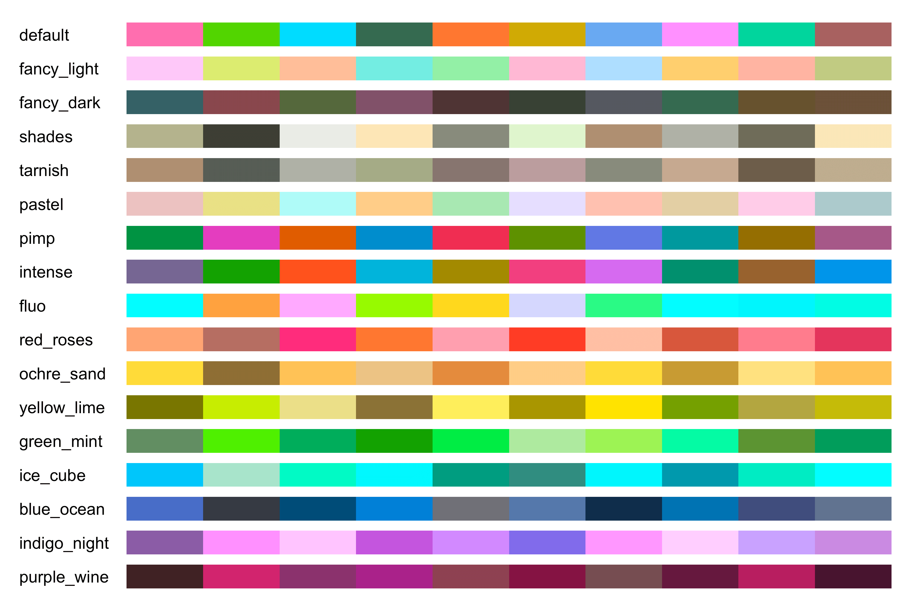
Figure 1: The 17 Gephi generative palettes added in ggsci 5.0.0 and py-ggsci 2.0.0.
Each preset has a distinct character. “Intense” is saturated and punchy, while “pastel” leans soft and recessive. “Fancy (dark background)” favors deep tones. The number of colors, though, is entirely up to you. Ask for 6 or 60, and the generator will find colors that are visually distinct within the mood you chose.
A real-world example
The payoff becomes clear when you have more categories than most fixed palettes can handle. Here is the t-SNE plot from the tissue-specific gene embeddings post, with 15 clusters rendered using the Gephi “intense” preset.
word_vectors <- readRDS(url("https://raw.githubusercontent.com/nanxstats/exp2vec/main/output/Pancreas_embedding.rds"))
tsne_out <- readRDS(url("https://raw.githubusercontent.com/nanxstats/exp2vec/main/output/Pancreas_tsne.rds"))

set.seed(42)
cl <- kmeans(word_vectors, centers = 15, iter.max = 20)
df <- cbind(as.data.frame(tsne_out$Y), as.factor(cl$cluster))
names(df) <- c("x", "y", "cluster")

ggplot2::ggplot(df, ggplot2::aes(x = x, y = y)) +
  ggplot2::geom_point(ggplot2::aes(colour = cluster), alpha = 0.3, size = 1) +
  ggplot2::guides(colour = ggplot2::guide_legend(override.aes = list(alpha = 1, size = 3))) +
  cowplot::theme_minimal_grid() +
  ggsci::scale_color_gephi(palette = "intense")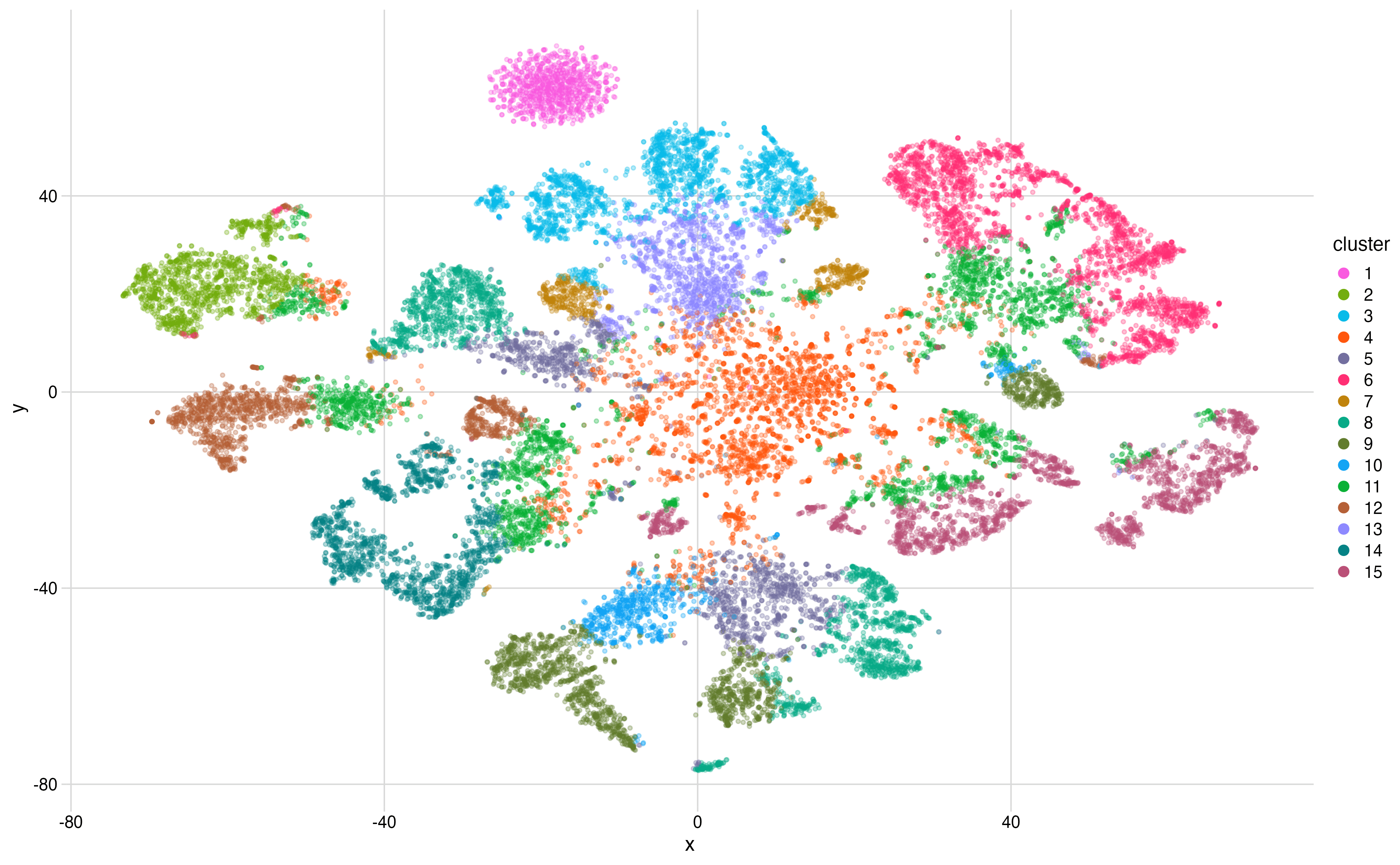
Figure 2: A t-SNE plot of tissue-specific gene embeddings rendered with the Gephi intense palette. Each point is a gene, the color indicates its cluster assignment.
OK! Now, everything below is mostly technical details about the implementation. Feel free to skip the next sections if you only want to know what’s new.
Why Gephi
I first knew Gephi at a visualization summer school in 2010, and it has been my favorite tool for network visualization ever since. What keeps me coming back is its design and product sensibility as a whole:
- Bringing your own data is easy. The import feature just works.
- The defaults look good without major tuning efforts: sensible color palettes and Bézier curve edges that feel polished off-the-shelf.
- A plugin system that lets people extend it without cluttering the core.
Designing a new color palette generator from scratch is a daunting task. The better move is to recognize that someone has already solved the problem well and bring their solution to a new context. Gephi’s palette generator has been serving the network visualization community reliably for over a decade. That track record is worth more than novelty.
The algorithm
The core idea behind Gephi’s generator is deceptively simple. Each preset defines a region of the CIE Lab color space by specifying allowable ranges of hue, chroma, and luminance. These ranges together describe a visual mood. The “intense” preset permits high chroma and wide hue range. The “pastel” preset restricts chroma and lifts luminance. The presets are where the taste lives.
Within those constraints, the generator can produce an arbitrary number of category colors that look relatively distinct, even though the exact result depends on the random seed. The underlying mechanism is, as you might guess, a constrained k-means clustering algorithm operating in the color space.
The algorithm keeps only colors that satisfy the preset’s limits and also convert safely to RGB. It starts with random candidate colors in a normalized Lab-like space, then repeatedly assigns a large grid of valid sample colors to their nearest candidate and moves each candidate toward the average of its assigned samples. If an average falls outside the allowed region, the algorithm snaps that candidate to the nearest valid sample instead. After several refinement rounds, the final colors are reordered so that consecutive colors are as different from the already chosen ones as possible.
This division of labor feels right to me. The presets capture a human judgment about what the palette should feel like. The algorithm handles the combinatorics of making k colors distinguishable within that feeling. The result is that you get the coherence of a curated palette with the flexibility to scale to any number of categories.
What’s next
I’m always looking for color palettes worth bringing to ggsci, whether they come from design systems, visualization research, or tools that have earned their defaults through years of use. If you have a favorite that you think deserves a wider audience, please let me know by opening an issue.