ggsci 4.0.0: 400+ new color palettes

After the last update in June 2024, I am excited to announce the release of ggsci 4.0.0 and ggsci for Python 1.0.0. You can install the R package ggsci from CRAN:
install.packages("ggsci")And install the Python package from PyPI:
pip install ggsciThis update brings over 400 new discrete color palettes for ggplot2 and plotnine visualizations. With this many new options, I almost surely will not have to worry about running out of palettes for producing my plots again.
New color scales
This release introduces three new discrete color scales, with the underlying palettes sourced from popular design systems and terminal color schemes.
Primer
Primer is GitHub’s design system. This color scale includes the 17 mark colors from Primer’s data visualization guide.
p1 <- ggsci::example_scatterplot() + ggsci::scale_color_primer()
p2 <- ggsci::example_barplot() + ggsci::scale_fill_primer()
gridExtra::grid.arrange(p1, p2, ncol = 2)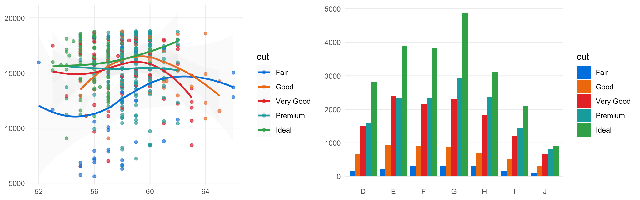
Figure 1: ggplot2 examples using the Primer color scale.
Atlassian Design System
The Atlassian Design System color scale is based on their chart colors for data visualization. It offers a specific sequence of 8 colors for categorical data.
p1 <- ggsci::example_scatterplot() + ggsci::scale_color_atlassian()
p2 <- ggsci::example_barplot() + ggsci::scale_fill_atlassian()
gridExtra::grid.arrange(p1, p2, ncol = 2)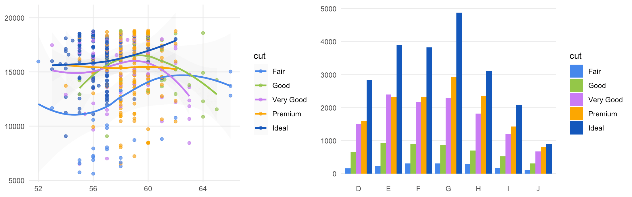
Figure 2: ggplot2 examples using the Atlassian Design System color scale.
iTerm
The iTerm color scale includes all current 435 color schemes from the iterm2-color-schemes project. Each palette provides 6 colors with two possible variants: normal and bright. To help you explore all the options, I created a Quarto microsite where you can preview every palette: https://nanx.me/ggsci-iterm/. The page is quite long, so be sure to use the independently scrollable table of contents on the sidebar.
p1 <- ggsci::example_scatterplot() + ggsci::scale_color_iterm("Rose Pine")
p2 <- ggsci::example_barplot() + ggsci::scale_fill_iterm("Rose Pine")
gridExtra::grid.arrange(p1, p2, ncol = 2)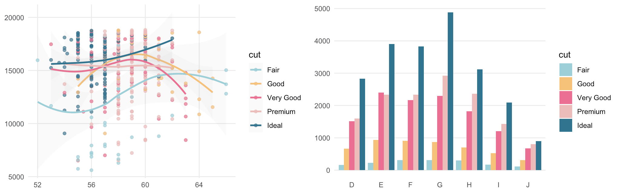
Figure 3: ggplot2 examples using the iTerm color scale with the Rosé Pine palette—a favorite Neovim color scheme used by @ThePrimeagen.
So, why add terminal color schemes?
For months, I have been using the Ghostty terminal emulator, which features built-in themes from the iterm2-color-schemes project. I thought it would be cool to use these beautiful themes in data visualizations. While not all are suitable for plotting, many are designed with decent contrast and vibes. This inspired me to bring them to ggsci, so you can easily apply them to your ggplot2 and plotnine pipelines.
Customizing color scales
As a reminder, the R package includes a FAQ vignette that addresses the most common questions from real ggsci users, such as “how to handle more data categories than available colors” or “how to customize the color order in a palette”. There, you will find practical recipes to get your work done quickly.